Help Center

Create, edit, activate, and preview paths before publishing them to your storefront.

What is a path?

A path is a step-by-step shopping experience you build for your customers. Each path contains one or more steps, and each step can display products, content, and options. You can create multiple paths for different purposes — bundles, gift sets, product configuration, and more.

Create a new path

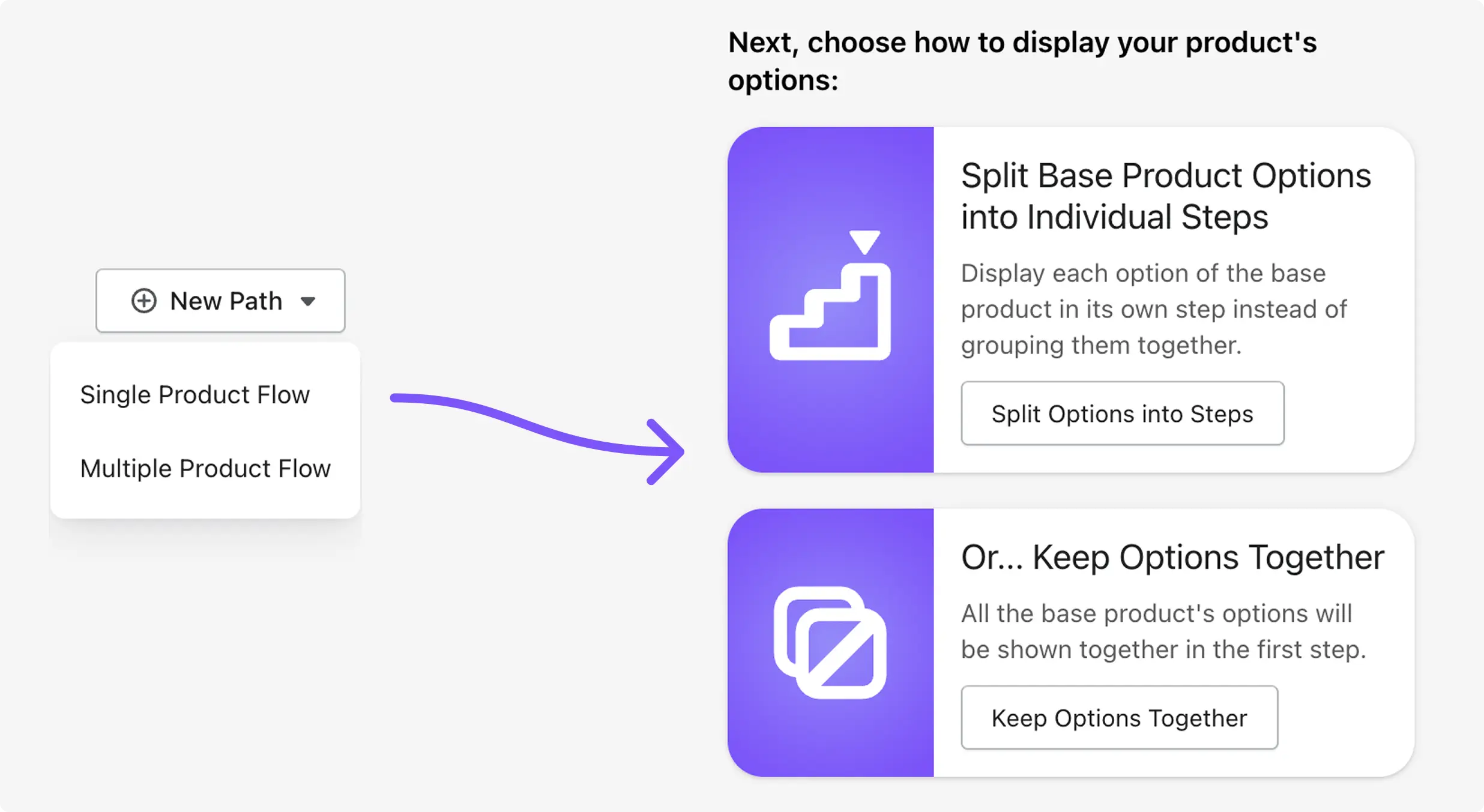
  • Go to My Paths and click Create First Path (or New Path if you already have paths).
  • Choose the type of path you want to build.
  • For most first-time setups, choose Multiple Product Flow.
  • Choose Single Product Flow when your path is centered on one main product.
Shopify admin page showing the selection between single product flow and multiple product flow when creating a new path

Not sure which flow type to choose? Start with Multiple Product Flow — it works for most use cases and is easier to set up.

Multiple vs Single Product Flow

  • Multiple Product Flow: Present different products across steps. Each product is added to the customer's cart individually as they move through the path. Best for bundles, kits, outfit builders, and cross-sells.
  • Single Product Flow: Center the path around one base product. Customers choose options step-by-step (like color, size, material). Additional add-on products can also be included. Everything is added to the cart together on a final summary step. Best for product configurators, personalized items, and made-to-order products.

Key difference

  • Multiple Product Flow: products go into the real Shopify cart immediately when the customer clicks Add to Cart.
  • Single Product Flow: selections are held in a temporary session until the customer clicks Add to Cart on the summary step, which adds everything at once.

Edit an existing path

  • Go to My Paths and find the path you want to update.
  • Click the cog icon on the path card to open the editor.
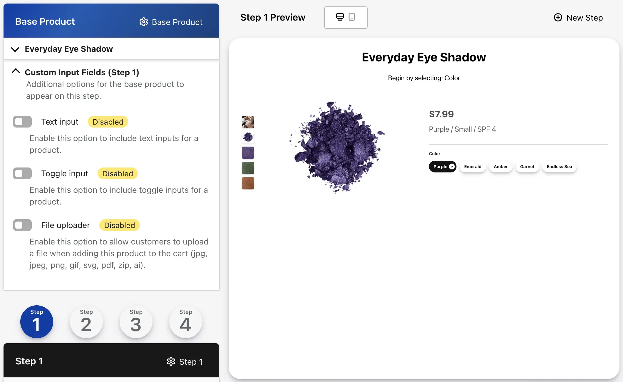
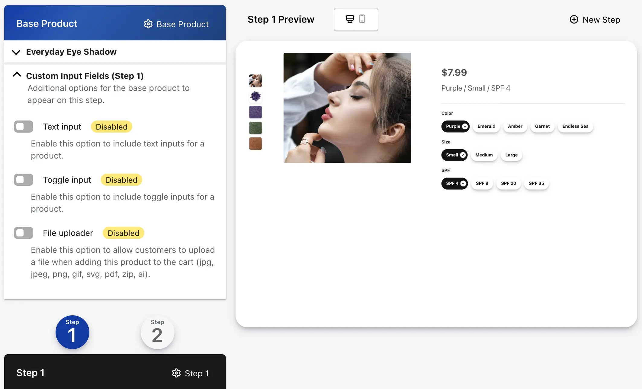
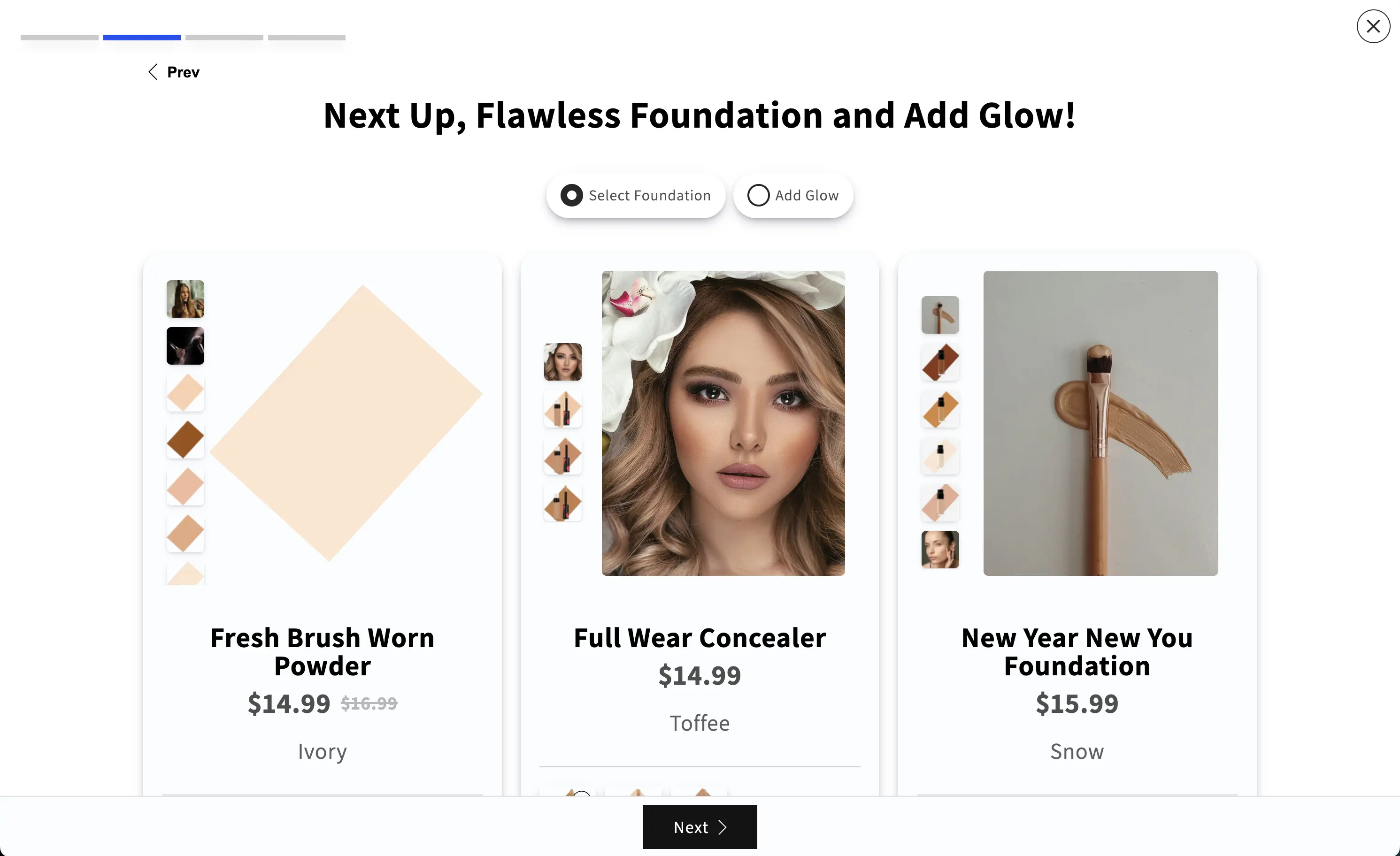
  • The editor has two sides: make changes on the left, see a live preview on the right.
  • The preview can be toggled between desktop and mobile views.

Path Settings

Click the Purchase Path Settings button (top-right of the editor) to open path-level settings. Here you can update:

  • Path title — the name customers see when choosing between multiple paths
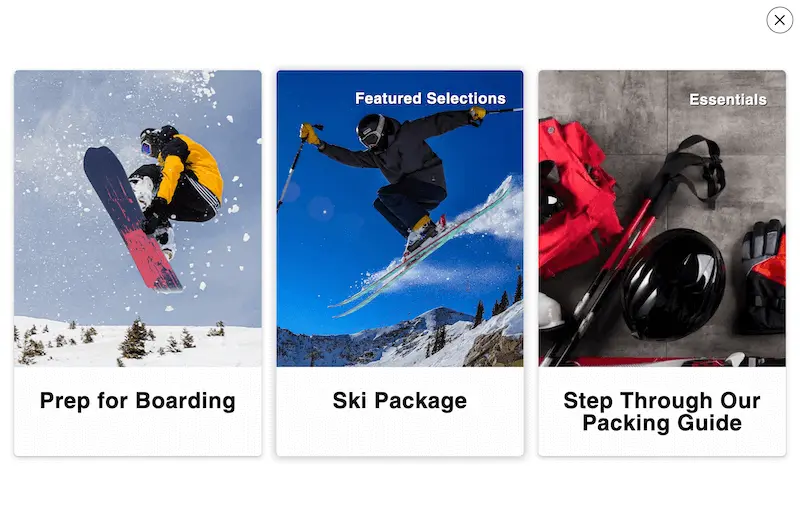
  • Cover image — shown on the path selection card
  • Label — a short tag like "Popular" or "New" shown on the path card
  • Description — rich text description of the path
  • Navigation button text — customize Next/Previous button text
  • Button styles — change button appearance
  • Progress bar — show or hide the step progress indicator
  • Mobile slider — show products in a horizontal swipeable row on mobile (for steps with more than two products)
  • Post-completion redirect — where to send the customer after the path is complete
  • Active/Inactive toggle — controls whether the path appears on your storefront
  • Delete path — permanently removes the path (this cannot be undone)

Activate or deactivate a path

  • A path must be set to Active before customers can see it on your storefront.
  • If a path is saved but inactive, it still exists in the app but will not appear in your store.
  • Toggle the Active setting inside Purchase Path Settings.
A path will not appear on your storefront until it is set to Active — even if it has been added via the Theme Editor.

Preview your paths

  • In-editor preview: The right side of the editor always shows a real-time preview of the step you are editing. Toggle between desktop and mobile views.
  • Full path preview: Click the Preview All Paths button at the top of the editor to walk through the entire path as a customer would — from path selection through every step. This does not add anything to a real cart.

Delete a path

  • Open Purchase Path Settings and use the delete option.
  • Only delete a path if you are sure you no longer need it.
  • Deleting is permanent — all steps and products inside the path are also removed.
Deleting a path cannot be undone. All steps, products, and configuration inside the path will be permanently removed.

Set up a base product, choose how to display options, and understand the summary step.

What is Single Product Flow?

Single Product Flow centers your path around one main product (called the base product). Customers configure that product's options step-by-step, and can also choose additional add-on products along the way. Everything is held in a temporary session until the final summary step, where the customer adds it all to the cart at once.


Select a base product

  • When you create a Single Product Flow, the first thing you do is choose your base product from your Shopify catalog.
  • This product becomes the center of the entire path.
  • The customer's option choices (color, size, material, etc.) determine which variant of this product is added to the cart.

Split Options into Steps vs Keep Options Together

After choosing your base product, you decide how to display its options:

  • Split Options into Steps — each product option gets its own step. The customer makes one choice at a time. Example: Step 1 = choose color, Step 2 = choose size, Step 3 = choose material

    Example of splitting product options into separate steps
  • Keep Options Together — all product options appear on the first step. The customer selects everything at once, then moves on to add-ons. Example: color, size, and material all on the first step

    Example of keeping product options together on a single step

Choose Split for a more guided, one-decision-at-a-time experience. Choose Together for a faster experience when the product has few options.


If your product has 3 or more options, splitting them into steps usually creates a better customer experience.

Additional products (add-ons)

  • Beyond the base product, you can add more products to any step. These are treated as add-on products.
  • Add-on products are separate items — not options of the base product.
  • They appear on the summary step alongside the base product.
  • They are added to the cart together with the base product on the final summary step.

How the summary step works

  • Every Single Product Flow path ends with a summary step. This step is automatic and cannot be removed.
  • The summary step shows the base product with the selected variant, plus any add-on products chosen along the way.
  • The customer clicks one button to add everything to the cart at once.
  • After adding to cart, the path closes (Pop-up Mode) or completes (Embedded Mode) and the customer is redirected to the configured destination.
The summary step is generated automatically. You do not need to create it — it always appears as the final step in a Single Product Flow path.

Custom inputs in Single Product Flow

  • You can add custom input fields (text, toggles, file uploads) to collect extra information from customers.
  • Inputs on the base product attach to the base product's metadata in the Shopify cart at checkout.
  • Inputs on additional add-on products attach to each individual product's metadata.
  • Step-level custom inputs, including custom-options-only steps, attach to the base product in Single Product Flow.
  • In Single Product Flow, required text inputs on the base-product card keep Next/Done disabled until those fields are completed.
  • Use custom inputs for engraving text, special instructions, uploaded artwork, or yes/no options like gift wrapping.

Changing the base product

  • Once a base product is selected, changing it requires deleting the existing path and starting over. This is because product options, steps, and configuration are all tied to the original base product.
The base product cannot be swapped after the path is created. You will need to delete the path and create a new one with the correct base product.

Add, remove, and configure steps to build your guided shopping flow.

What is a step?

A step is one screen within your path. Each step can contain content (title, subtitle, description) and one or more products. Customers move through steps one at a time using Next and Previous buttons.

Add a step

  • Open your path in the editor.
  • Find the cog icon in the top-right corner of any existing step's header.
  • Click the cog icon to open the step options.
  • Choose Add a new step. The new step appears after the current step.

Remove a step

  • Click the cog icon on the step you want to remove.
  • Choose Remove this step.
  • Be careful — removing a step is permanent. All products and content in that step are also removed.
Removing a step is permanent. All products and content inside that step will be deleted and cannot be recovered.

Step content

Each step can include content that appears above the products. Use this content to guide the customer and explain what they should do.

  • Title — the main heading (e.g., "Choose Your Main Item")
  • Subtitle — a secondary heading (e.g., "Pick one to get started")
  • Description — rich text content with formatting options. Use this for longer explanations when needed.

Keep wording short and action-oriented. Good examples: "Choose your main item," "Pick a size," "Add matching accessories."


Short, action-oriented titles work best. Tell the customer exactly what to do on each step — e.g., "Pick your size" rather than "Size Options."

Step options (full list)

The step cog icon opens a modal with these options:

  • Add a new step — creates a new step after this one
  • Add a new product — adds a product from your Shopify catalog to this step
  • Remove this step — permanently deletes this step and everything in it
  • Product Display Rules — ask customers a question and show different products based on their answer (see Section 6)
  • Require at least one product — prevents the customer from moving to the next step until they add at least one product from this step (see Section 6)
  • Custom classes — add CSS class names for custom styling (advanced)
Product-level rules like "require this specific product" and "auto-proceed" are found on each product's own settings — not in the step options. See Section 6 for details.

When to use more steps

  • Break large decisions into smaller ones — customers are more likely to complete the path
  • Separate product categories (e.g., main products on one step, accessories on the next)
  • Create upsell opportunities by introducing add-ons at the right moment
  • Guide customers through a logical sequence that mirrors how they think about the purchase

When to use fewer steps

  • When you only have a few products to show
  • When the customer does not need guidance to make their selection
  • When a faster checkout experience is more important than a guided one

Add products, customize how they appear, and control variant selection.

Add a product to a step

  • Click the cog icon on the step where you want to add a product.
  • Choose Add a new product.
  • Select a product from your Shopify catalog.
  • In Single Product Flow, any product added beyond the base product is treated as an add-on.

Remove a product

  • Click the cog icon on the product card within the step.
  • Choose the remove option.

Product display settings

Each product has its own customization options. Access them through the product's cog icon. You can change:

  • Title override — replace the product's default title with custom text
  • Product label — add a label like "Best Seller" or "Most Popular" that appears on the product card
  • Description — rich text description that replaces or adds to the default product description
  • Star rating display — show or hide a star rating
  • Media images — control whether product images are displayed
  • Zoom effect on hover — enable a zoom when customers hover over product images
  • Hide quantity input — hide the quantity selector so only one unit is added at a time

Select variants from images

Instead of standard dropdowns or buttons, you can let customers choose product variants by clicking images. This is great for visual options like colors, fabrics, or finishes.

  • Enable Choose variants from image in the product settings.
  • Each variant combination is shown as a clickable image button below the main product image.
  • The images come from your product's variant setup in Shopify (not from MultiStep).
  • This works best when the total number of variants is small.
  • Make sure each variant has an image assigned in your Shopify product settings before enabling this.

Example: A product with Color (blue, green) and Size (large, small) would show 4 image buttons — Large/Blue, Large/Green, Small/Blue, Small/Green — instead of two dropdown menus.


Each variant must have an image assigned in Shopify before enabling this feature. Variants without images will show a blank button.
This works best with a small number of variants. Products with many variant combinations (e.g., 5 colors × 4 sizes = 20 buttons) may be better served with standard dropdowns.

Custom input fields

Collect extra information from customers by adding custom input fields to products.

  • Text input — customers type information (e.g., engraving text, special instructions)
  • Toggle input — a yes/no or on/off switch (e.g., "Add gift wrapping?")
  • Radio input: Single-select options where the question is stored as the property label and the selected option is stored as the value.
  • File uploader — customers upload a file (e.g., custom artwork, logo, reference image)

Required Text Input Fields

  • Only text input fields can be marked required.
  • For product Add to Cart actions, empty required text fields block submission in both Multiple Product Flow and Single Product Flow additional-product cards, and missing fields are highlighted.
  • In Single Product Flow base-product steps, Next/Done stays disabled until required text fields are complete.
  • If a required text field is inside a conditionally shown input group, it is enforced only while that conditional toggle is on (in both flow types).

How custom input data is stored

  • In Multiple Product Flow: input values attach to the individual product's metadata in the Shopify cart.
  • In Single Product Flow (base product): input values attach to the base product's metadata.
  • In Single Product Flow (add-on products): input values attach to each add-on product's own metadata.

Custom input data appears as line item properties at checkout, so you and your fulfillment team can see exactly what the customer entered.


Custom input data is visible on the order details page in Shopify admin and on packing slips, so your fulfillment team can see exactly what the customer entered.

Mobile product slider

  • When enabled in Purchase Path Settings, steps with more than two products display as a horizontal swipeable slider on mobile devices.
  • Customers can swipe left and right to browse products on smaller screens.
  • This applies to all products in Multiple Product Flow and to add-on products in Single Product Flow (not the base product).
  • Preview on mobile after enabling to make sure it looks right for your products.
The mobile slider only activates on steps with more than two products. Steps with one or two products will display normally on mobile.

Choose Pop-up or Embedded display mode.

After building your paths in the MultiStep admin, you need to add MultiStep to your Shopify storefront so customers can access it. This is done through Shopify's Theme Editor — the same tool you use to customize your store's design and layout.

Two display modes

  • Pop-up Mode: Adds a button to your page. When the customer clicks the button, MultiStep opens in a full-screen overlay. The customer moves through the path inside the overlay, and it closes when the path is complete.
  • Embedded Mode: Places the MultiStep path directly on the page as part of the page content. No button needed — the path is visible right away.

Pop-up Mode requires two separate actions in the Theme Editor. Missing either one will cause problems.

  1. Add the block: Add the MultiStep Pop-up Mode block to the page section where you want the button to appear.
  2. Enable the app embed: Click the App Embeds icon (bottom of the left sidebar), find Enable Pop-up Content, and turn it on.
This is the most common setup mistake. The block adds the visible button, but the app embed adds the invisible pop-up container. If you only add the button without the app embed, the button will appear but clicking it will do nothing.


Setting MultiStep path in Theme Customizer

Embedded mode setup (one step)

  • Add the MultiStep Embedded Mode block to the page section where you want the path to appear.
  • Save the theme. The path renders directly on the page.
  • Use Pop-up Mode when you want a button on the page that opens the experience on click. Best for product pages, add-on offers, and pages where you want a cleaner layout until the customer starts shopping.
  • Use Embedded Mode when you want the full path visible right on the page. Best for landing pages, dedicated sales pages, and pages where the path should be the main content.

Display filters and path targeting

Both Pop-up Mode and Embedded Mode blocks have a display filter setting in the Theme Editor sidebar. This controls which paths appear on the storefront.

  • Single AND Multiple — show all active paths regardless of type
  • Multiple ONLY — show only Multiple Product Flow paths
  • Single ONLY — show only Single Product Flow paths
  • Just Show ONE Path (enter an ID) — show only one specific path by entering its ID
If the filter does not match any active paths, nothing will appear on your storefront. For example, if you set the filter to "Multiple ONLY" but only have active Single Product Flow paths, the display area will be blank.

Finding a path ID

  • Path IDs are shown on each path card in the My Paths view in the MultiStep admin. An example ID looks like: 3bc3af9b-4bff-4732-96f6-24478fe38d83

    Example path ID

How multiple paths appear to customers

  • If more than one active path matches your display settings, customers see a grid of path cards. Each card shows the path's cover image, title, and label. The customer clicks a card to enter that path.

    Storefront showing grid of path cards
  • If only one path matches, the customer goes directly into the first step — no card selection screen.
If only one active path matches the display filter, the path selection screen is skipped and the customer enters the first step directly.

Customize the start button (Pop-up Mode only)

  • Button text — change the text on the button (e.g., "Start Here", "Build Your Bundle", "Choose Your Package")
  • Button styles — change the button's visual appearance
  • Custom classes — add CSS class names for developer-level styling

Custom CSS

  • Both Pop-up Mode and Embedded Mode blocks include a Custom CSS for MultiStep text area in the Theme Editor sidebar.
  • Use this only if you or a developer want to customize MultiStep's appearance beyond the built-in options.

Important: Only add MultiStep once per page

  • Do not add MultiStep multiple times on the same page template.
  • Do not place both a Pop-up Mode block and an Embedded Mode block on the same page.
  • If both are added, only the Embedded version will show and the Pop-up button will not work.
  • Use one clear setup per page to avoid conflicts.
Do not place both a Pop-up Mode block and an Embedded Mode block on the same page. If both are added, only the Embedded version will render and the Pop-up button will not work.

Use simple logic rules to control what customers see and when they can continue.

MultiStep includes several logic features that control how products are shown to customers and how the path flow behaves. These are configured at the step level or product level within the admin editor.


Show products based on customer's answer

Ask a question and show different products depending on which option the customer picks. This makes the path feel more tailored without building separate paths.

  1. Add all the products to the step first.
  2. Open the step options (cog icon) and find Product Display Rules.
  3. Enter your question (e.g., "Who is this for?") and two answer options (e.g., "Adult" and "Child").
  4. Use the toggles to assign each product to Option 1 or Option 2.
  5. Save and test. When the customer picks an answer, only the matching products appear.
You must add products to the step before setting up display rules. In Single Product Flow, display rules apply only to add-on products, not the base product.

Example of a MultiStep path on a storefront, showing a step with content and products

Require at least one product to continue (step-level)

  • When enabled, the Next button is disabled until the customer adds at least one product from this step.
  • Any product in the step satisfies this requirement.
  • Use this when a step presents required choices, not optional add-ons.
  • The "at least one" check counts standard products on the step. Products set to "Show only when other products are purchased" do not satisfy this requirement by themselves.
  • Enable it in the step options (cog icon).

Require a specific product to continue (product-level)

  • When enabled, the customer cannot proceed unless this exact product has been added.
  • Use this when one specific product is essential before accessories or add-ons can be chosen.
  • If a required product is currently hidden by display logic, trying to continue reveals and highlights that required product card.
  • Enable it in the product options (product cog icon).
The step-level "require at least one" is satisfied by any product on the step. The product-level "require this product" is only satisfied by that exact product. These are found in different places — step cog vs. product cog.

Automatically proceed when product is added (product-level)

  • When enabled, the path automatically advances to the next step as soon as the customer adds this product.
  • Best for steps with only one product where selecting it should immediately move forward.
  • Use carefully on steps with multiple products — the path will advance as soon as this product is added, even if the customer has not seen the other products.
  • Auto-proceed still respects required product checks and is blocked when required text inputs on that card are empty.
  • Avoid combining auto-proceed with "Show only when other products are purchased" on the same step, because customers may skip the upsell reveal.
  • If auto-proceed can complete the final step, set a completion redirect URL to avoid reloading the current page.
  • Enable it in the product options (product cog icon).
Use auto-proceed carefully on steps with multiple products. The path will advance immediately when this product is added — the customer may miss other products on the same step.
  • When enabled, this product is hidden until all other products in the same step have been added to the cart.
  • Once the customer adds the other products, this product appears as a final recommendation.
  • Use this for upsells, bundle completion, or premium upgrade suggestions.
  • Enable it in the product options (product cog icon).

Example: A step has three products — a shirt, pants, and a belt. Set the belt as the recommended product. The customer sees only the shirt and pants first. After adding both, the belt appears as a "Complete the outfit" suggestion.

Custom CSS classes on steps

  • You can add custom CSS class names to any step's container element.
  • This is only useful if you or a developer plan to write custom CSS to style specific steps differently. Most store owners will not need this.

Auto-add the current product and walk customers through add-ons directly from any product page.

What is Auto-Add Product on Product Page?

This is a Pop-up Mode feature designed specifically for product pages. When enabled, the product the customer is currently viewing is automatically added to the Shopify cart the moment the MultiStep pop-up opens.

How it works

  1. The customer is on a product page and selects their options (color, size, etc.).
  2. The customer clicks the MultiStep start button.
  3. The product page's product is immediately added to the Shopify cart.
  4. The MultiStep pop-up opens.
  5. A brief success message appears in the corner of the page confirming the product was added.
  6. The customer continues through the MultiStep path to choose add-ons, accessories, or related products.

How to enable it

  1. Open Shopify Theme Editor.
  2. Navigate to the product page template.
  3. Select the MultiStep Pop-up Mode block.
  4. In the sidebar settings, enable Auto-Add Product on Product Page.
  5. Save and test on a live product page.

Important things to know

  • Applies to all product pages using the same template: This setting is part of the product page template. If your store uses one default product page template, every product page will have this behavior.
  • Different paths for different products: To show different MultiStep experiences on different product pages, create separate product page templates in Shopify and assign each template to the appropriate products.
  • Consider hiding the default Add to Cart button: When using Auto-Add, the store's regular Add to Cart button can cause confusion. Consider hiding it and using the MultiStep button as the primary call to action. Update the button text to explain what will happen (e.g., "Add to Cart & Choose Accessories").
  • Only works on product pages: The Auto-Add setting may appear in the Theme Editor regardless of which page template you are editing, but it only works on product pages where there is a "current product" to add.
Consider updating the MultiStep button text to something descriptive like "Add to Cart & Choose Accessories" so customers know what will happen when they click.

If Auto-Add is not working

  • The product must be available for sale (not sold out).
  • The selected variant must exist and be in stock.
  • The feature only works on product page templates. Enabling it on other page types will have no effect.

Troubleshooting

Quick fixes for the most common setup issues.

The start button appears, but pop-up does not open

The Pop-up Content app embed is not enabled. This is the #1 most common issue.
  • Go to Theme Editor → click the App Embeds icon (bottom of the left sidebar).
  • Find Enable Pop-up Content and turn it on.
  • Save the theme and test again.

The start button is not showing

Possible causes:

  • The MultiStep block was not added to the page template.
  • You are viewing a different page or template than the one you configured.
  • Both a Pop-up Mode block and an Embedded Mode block were added to the same page (only the Embedded version will render). Remove one and use a single display mode per page.

MultiStep area is blank (no paths visible)

Possible causes:

  • No paths are set to Active. Open each path → Purchase Path Settings → toggle Active.
  • The display filter does not match your active paths. If you set it to "Multiple ONLY" but only have Single Product Flow paths active, nothing will show.
  • If using "Just Show ONE Path," the path ID may be incorrect. Double-check it matches the ID shown in My Paths.
  • After making changes, save the Theme Editor and refresh your storefront.
Always check both the path's Active status in the MultiStep admin and the display filter in the Theme Editor. Both must be correct for paths to appear.

Product changes in Shopify are not reflected in the MultiStep admin

Cause: MultiStep takes a snapshot of each product when it is added to a step. This snapshot is not automatically updated when you edit the product in Shopify.

  • Remove the product from the step, then add it again. This creates a fresh snapshot.
  • Important: This only affects the admin editor preview. Your live storefront always pulls fresh product data from Shopify, so customers always see the current product information.
Don't worry — this only affects what you see in the admin editor. Your live storefront always displays the latest product data directly from Shopify.

Auto-Add Product on Product Page is not working

  • The product must be available for sale and not sold out.
  • The selected variant must exist and be in stock.
  • The feature only works on product page templates. Enabling it on other page types will have no effect.

Path was built but never appears on the store

Check these items in order:

  1. Is the path saved?
  2. Is the path set to Active in Purchase Path Settings?
  3. Has MultiStep been added to the storefront via Theme Editor?
  4. Does the display filter include the path type you created?
  5. If using Pop-up Mode, is the Enable Pop-up Content app embed turned on?
Walk through every item in the checklist above. In most cases, one of these five steps has been missed.

Still need help?

Contact support if:

  • Your path is active but still will not appear.
  • Your pop-up setup looks correct but still does not open.
  • Product behavior does not match what you configured.
  • You need help choosing the right path structure.
  • You want help with custom styles to match your theme.
  • You have a suggestion for a new feature or improvement.